Why the wheat
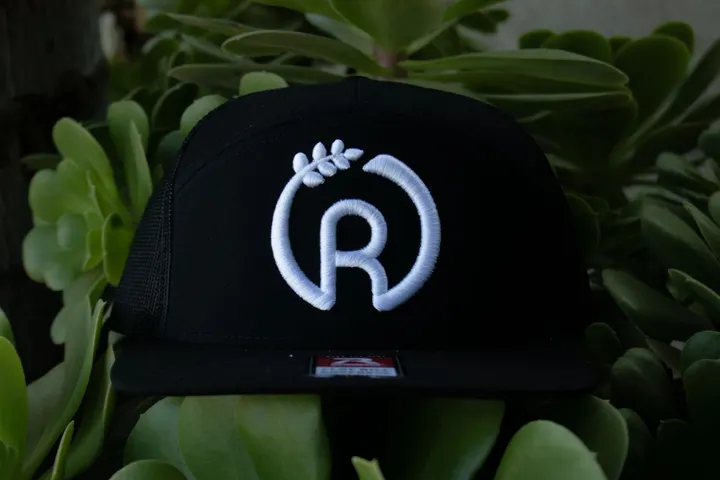
A simple design can carry a lifetime of meaning. Our logo, a bold R wrapped by a grain of wheat and a ring, tells a story that runs deep.
The grain of wheat is more than a symbol. It reflects a truth that has shaped my life: a grain of wheat must fall to the ground and die before it can grow into something greater.
I lost my mom when I was 18, two weeks before I left for college. It was one of the hardest moments of my life. Years later I lost my sister, one of the many people who pushed me to be better. I've also lost opportunities and paths I thought were meant for me, and only later understood that those losses were pruning me for something bigger.
The R used to stand for my last name, Ramirez. Today it stands for more. Resilience in the face of trials. Resourcefulness when life demanded I adapt. Responsibility for the choices that shape my future. And resolve to honor my losses by living a full, meaningful, radiant life.
The circle around the R once was the letter O, for my first name. Now it's a reminder of how the world keeps turning back to the lessons those losses taught me. Every challenge, every heartbreak, every closed door brought me back to a clearer sense of who I am and what I'm here to do.
So this mark is more than a brand. It's about growing through pain, finding strength in sorrow, and taking the long road of becoming who you are.
To everyone who's ever faced a loss: you're not alone. You can grow through it, too.
And to everyone who has supported this dream, who chose to understand instead of judge and to celebrate instead of envy: my team and I thank you from the bottom of our hearts. Your kindness has been a light on our path.
Simply, thanks.
Omar Ramirez